Lanka Developers Community

    Lanka Developers

    • Register
    • Login
    • Search
    • Categories
    • Recent
    • Tags
    • Popular
    • Users
    • Groups
    • Shop
    1. Home
    2. accessiwise
    3. Posts
    • Profile
    • Following 0
    • Followers 0
    • Topics 2
    • Posts 2
    • Best 0
    • Controversial 0
    • Groups 0

    Posts made by accessiwise

    • How to Design a Website That Turns Visitors into Customers

      ChatGPT Image Apr 17, 2026, 08_35_44 AM.png

      A friend of mine runs a small skincare brand in Los Angeles. She had been selling mostly through Instagram and word of mouth, and at some point decided to invest in a proper website. She hired a designer, spent around four thousand dollars, and launched something that honestly looked beautiful. Clean layout, nice fonts, good product photos.
      Three months later, she called me. The website was getting decent traffic from her Instagram bio,o but almost nobody was buying. People were landing on the site and leaving without doing anything.
      The design looked great. But it was not doing its actual job.

      Looking Good and Working Well Are Two Different Things
      This is the thing most people do not realize when they think about website design. A website that looks impressive and a website that actually converts visitors into customers are not the same thing. Sometimes they overlap. Often they do not.
      A good-looking website makes you feel proud when you share the link. A website that works makes you money while you sleep. The goal is to build the second one, and ideally make it look good too.
      The difference comes down to how clearly the site guides someone from landing on the page to taking an action. Every design decision either helps that journey or gets in the way of it.

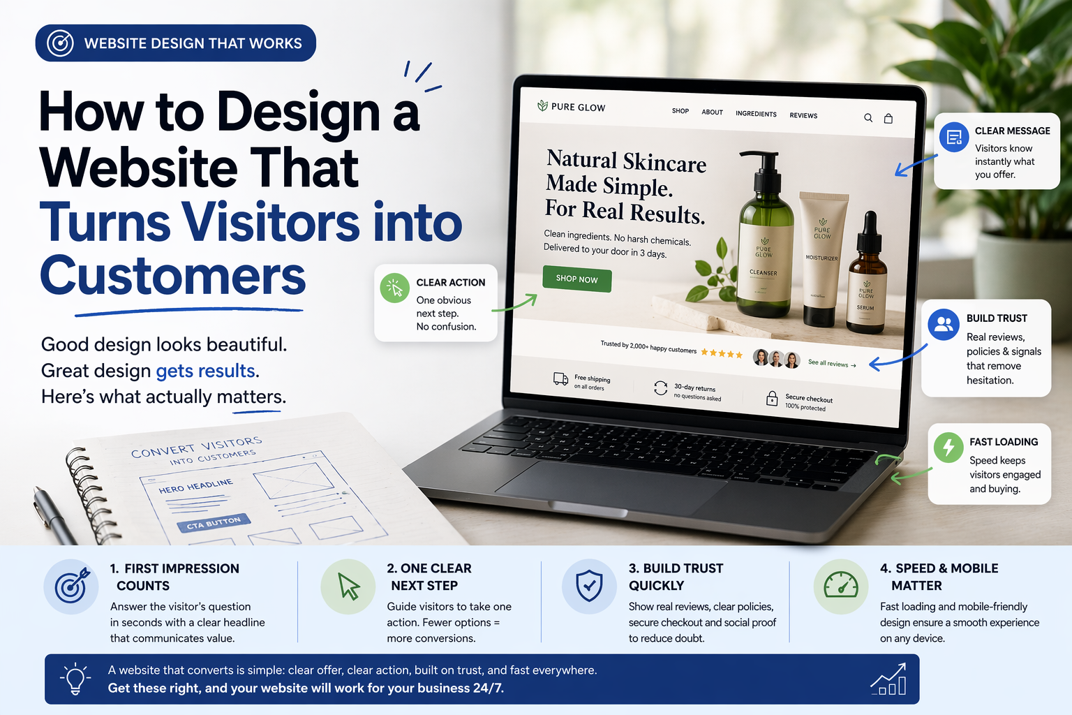
      The First Few Seconds Decide Everything
      When someone lands on your website, they are not reading carefully. They are scanning. In the first few seconds, they are trying to answer one question — is this what I was looking for?
      If your homepage does not answer that immediately, most people leave. Not because they did not like the design. Because they were not sure what the site was even about.
      Your headline is doing most of this work. It needs to be plain and direct. Not "empowering your journey to wellness" but something like "natural skincare products made without harsh chemicals, delivered across the US in three days." You read that, and you immediately know if you are in the right place.
      My friend's homepage headline was the name of her brand in large letters. Beautiful typography. Zero information. That was the first thing we changed.

      Make It Obvious What You Want People to Do
      Every page on your website should have one clear next step. Not five options. One.
      If you want someone to buy, make the buy button obvious. If you want them to book a call, make that the only thing that stands out. When you give people too many options, they freeze and do nothing. This is not a theory. It happens on almost every website that is struggling to convert.
      A software company in San Francisco had a homepage with four different buttons in the header — Start Free Trial, Watch Demo, Read Docs, and Contact Sales. They removed three of them and kept only Start Free Trial. Signups went up 38% the following month without changing anything else on the page.
      One clear action. That is it.

      Trust Is Built in Small Moments
      People do not buy from websites they do not trust. And trust is not built through a mission statement or a values page. It is built through small, specific things placed in the right spots.
      Real customer reviews with actual names and photos matter more than a generic testimonials section. A clear return policy mentioned near the buy button removes hesitation right when someone is about to click. Showing exactly how many people have bought or how long the company has been around adds quite confidence.
      My friend added twelve reviews from real customers with photos to her product pages. She added a simple line near the checkout button saying free returns within thirty days. Her conversion rate went from 0.8% to 2.4% in six weeks. Same traffic, same products, same prices.

      Slow Loading Kills Conversions Before They Start
      You can have a perfect headline, clear buttons, and strong trust signals. If the page takes six seconds to load, most people are already gone.
      Speed is part of the design. It is not a separate technical concern you deal with after launch. Uncompressed images, too many plugins, cheap hosting — these things add seconds, and those seconds cost you, customers, directly.
      Run your site through Google PageSpeed Insights. If your score is below 70 on mobile, that is hurting you more than any design problem.

      Mobile cannot be an afterthought
      More than half of all web traffic is on phones. If your website was designed on a laptop and only tested on a laptop, there is a good chance the mobile experience is broken in ways you have not noticed.
      Buttons that are too small to tap. Text that runs off the screen. Images that take forever to load on a mobile connection. These things are invisible to you in the office and very obvious to the customer trying to buy on their phone.
      Test your site on an actual phone, on an actual mobile network, before you call the design done.

      Getting the Design Right From the Start
      A lot of conversion problems come from working with designers who are focused on how the site looks rather than how it performs. If you are looking for Website Design Services in California, find a team that asks about your goals, your customers, and what action you want visitors to take — not just what colors and fonts you like.

      A website that converts is not complicated. It is clear about what it offers, makes the next step obvious, builds trust quickly, and loads fast on every device. Get those four things right, and the design does its actual job.

      posted in Artificial Intelligence
      accessiwise
      accessiwise
    • How Website Design Impacts Customer Trust and Sales

      Collaborating on California website design.png

      Imagine you’re walking down a street, looking for a place to eat. You see a spot with a handwritten sign taped to the window. The glass is smudged. Inside, the menus are sticky and half the lights are off.

      You aren't thinking about the "brand equity" or the "user interface." You’re just thinking: If the front of the house looks like this, what does the kitchen look like?

      A website is your digital storefront. People don't just look at it; they feel it. Within a second of landing on your page, a stranger decides if you’re a professional or a flake. It isn't fair, but it’s how our brains work.

      The Cost of a Bad First Impression

      Most business owners think design is about picking the right shade of blue. It isn't. Design is about reducing anxiety.

      When a customer visits a site that loads slowly or has broken links, their "scam radar" goes off. They start wondering if their credit card info is safe. They wonder if the product actually exists.

      If your site feels like it was built in 2005 and abandoned, you are essentially telling your customers that you don't pay attention to details. Why would they trust you with their money?

      Why "Pretty" Isn't Enough

      I’ve seen plenty of beautiful websites that couldn't sell a glass of water in a desert. Why? Because they were confusing.

      Have you ever been on a site where you couldn't find the "Contact" button? Or where the text was so small you had to squint? That’s bad design.

      Real design is about clarity. It’s about making the path from "Hello" to "Check out" as smooth as possible. If a user has to stop and think about where to click next, you’ve already lost them. We call this the "friction" of a website. The more friction you have, the fewer sales you make.

      Speed is the Ultimate Trust Signal

      We are all impatient. If a page takes more than three seconds to load, most people are gone.

      A fast website says you respect the customer's time. A slow website says you’re lazy. It’s that simple.

      When you look for the Best Website Design Services in California, the ones who actually know what they’re doing won't talk about fancy animations first. They’ll talk about load times. They’ll talk about clean code. Because a site that doesn't load is a site that doesn't sell.

      The Mobile Trap

      Think about how many times you check your phone in a day. Probably a hundred.

      If your website looks great on a giant office monitor but looks like a mess on an iPhone, you’re alienating half your audience.

      Buttons should be easy to tap. Text should be easy to read without zooming in. If a customer has to "pinch and zoom" just to see a price, they’re going to close the tab and go to your competitor.

      Human Connection vs. Corporate Fluff

      People buy from people. They don't buy from "Global Leaders in Innovative Solutions."

      If your website is filled with stock photos of people shaking hands in a boardroom, stop. Everyone knows those aren't your employees. It feels fake. It feels like you’re hiding something.

      Use real photos. Use plain English. Speak to your customer like a friend who is trying to help them solve a problem. When you stop trying to sound "important" and start sounding "human," people start to trust you.

      The "Add to Cart" Anxiety

      The moment someone clicks "Buy" or "Inquire," their heart rate goes up a little.

      Will this actually ship? Is there a hidden fee? Can I get a refund if it’s broken?

      A good design answers these questions before they are even asked. You put the shipping costs upfront. You put the return policy right there. You show the logos of the payment processors you use.

      This isn't just "design." It’s psychology. You are removing the hurdles one by one until there’s no reason for them to say no.

      Proof is the Best Salesman

      You can say you’re the best all day long. Nobody cares. They care what other people say.

      Social proof—reviews, testimonials, logos of past clients—needs to be woven into the design. Not buried on a page titled "Our Awards." It needs to be where the customer is looking.

      If I see a real person with a real name saying your service changed their life, my trust in you goes up by 100%. If I just see a block of text that says "We are the #1 provider," I don't believe a word of it.

      Fix the Small Things First

      You don't need a total overhaul tomorrow. You just need to stop the bleeding.

      Check your links. Make sure your phone number is clickable. Update that copyright date in the footer so it doesn't say 2019.

      These small "broken" things act like papercuts. One doesn't kill the sale, but ten of them make the customer bleed out. They just give up and leave.

      The Reality of Sales

      At the end of the day, your website is an employee. It’s your 24/7 salesperson.

      If that salesperson shows up to work in a wrinkled shirt, forgets the product names, and ignores the customers, you’d fire them. So why do we let our websites stay messy?

      Investment in design isn't a luxury. It’s the price of admission. If you want people to take you seriously, you have to look the part.

      Take a look at your site right now. If you were a stranger, would you trust yourself? If the answer is "maybe," then it’s time to get to work.

      posted in Artificial Intelligence
      accessiwise
      accessiwise
    • 1 / 1